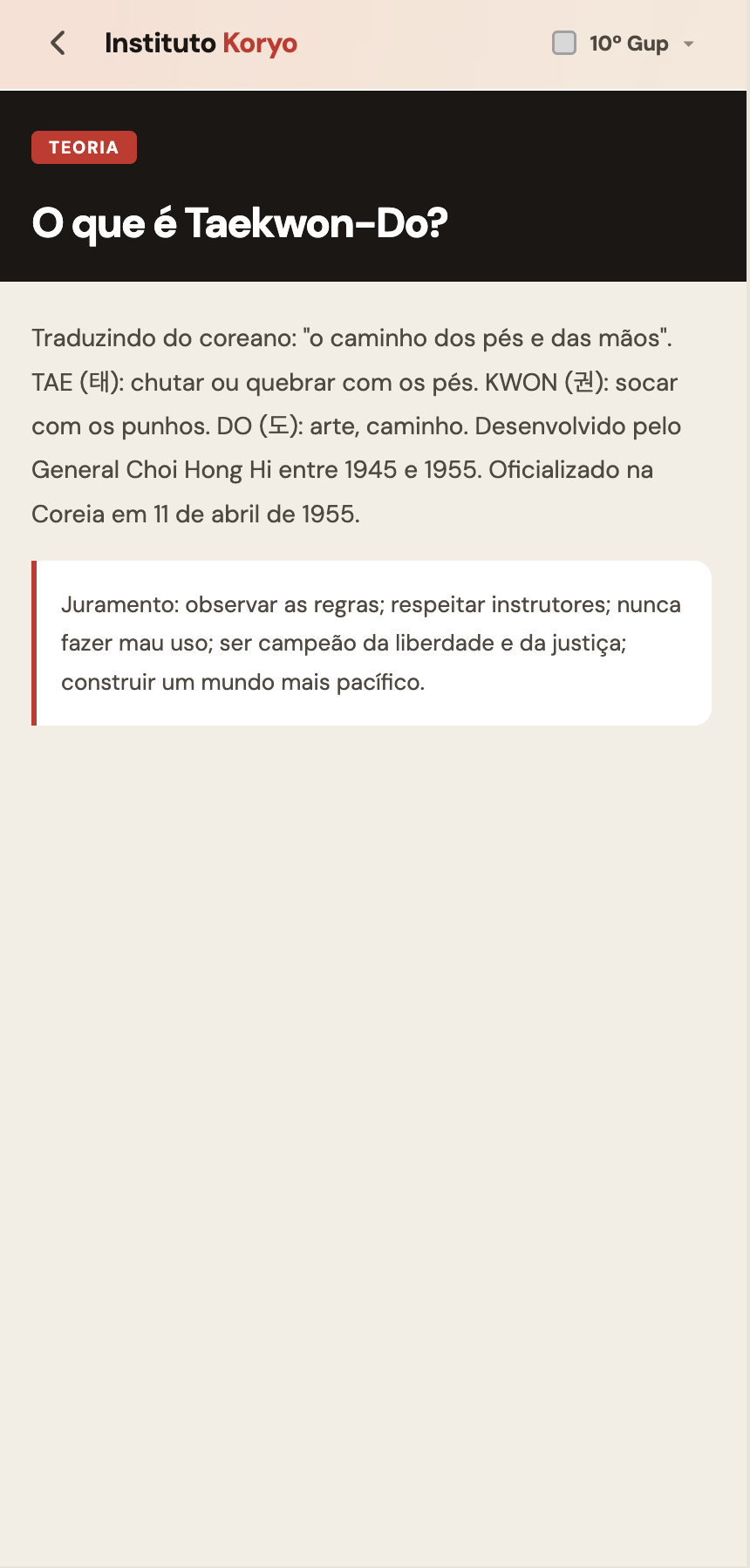
TKD LEARNING APP
A printed handout with 10 belt grades of content. Finding one technique mid-class took longer than the question deserved. The app replaced the handout.
Instituto Koryo is a Taekwondo school. Every student receives a printed handout with the full curriculum from white to black belt. It is dense, cross-referenced, and grows with each grade. Before graduation exams, students study it. During classes, they try to find things in it. Both situations were broken.
Solo end-to-end. Designed the full information architecture and interaction system, wrote all the code with Claude, curated and structured the content from the original printed material. Design, development, QA, and content authorship.
14 of 50 students use it weekly. The rest open it when graduation approaches. Mid-class content lookup went from page-flipping to 10 seconds.
Students use it weekly, 2 to 3 times. The remaining 36 use it in concentrated bursts before graduation exams.
Belt grades of content structured and made searchable. White belt through black belt, each with its own curriculum, vocabulary, techniques and quiz.
Students across all grades, ages mid-20s to 60s. Range shapes every interaction decision, from type size to navigation depth.
Finding one technique mid-class took longer than the question deserved.
Students preparing for graduation exams had too much to read and no structured way to test themselves. Some used post-its. Some annotated the handout. Some just stopped studying because the volume felt impossible. The handout was comprehensive but passive, it could only be read, not interacted with.
Mid-class was worse. A student asks about a technique. The instructor or student reaches for the handout, finds the right grade section, searches within it. By the time the answer surfaces, the class has moved on. The friction was not the content, it was the format.
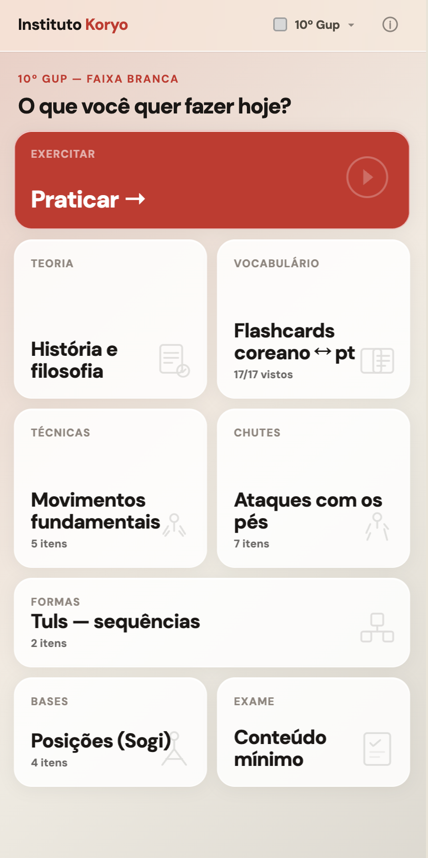
Home screen. Grade context at the top, content categories below. Primary action — Praticar — is the full curriculum review with quiz.
Cross-referencing everything increased cognitive load. Students needed less, not more.
The first architecture connected everything. Techniques linked to related techniques, stances to the moves that use them, Korean vocabulary to every context it appeared in. The logic was sound, those connections are how mastery forms. The result was a product that felt like the handout, just digital.
Conversations with students at different grades clarified the mistake. A white belt preparing for their first exam needs to know the 10th Gup curriculum. That is it. Surfacing connections to higher grades was noise. The architecture was rebuilt around a single mental model: what does a student at this grade need right now.
The grade selector became the primary navigation. Each grade contains its own complete world: theory, techniques, kicks, stances, patterns, Korean vocabulary flashcards, and a quiz over the full curriculum. Students choose their grade and enter a focused context. The connections exist within that context. They do not bleed between grades.
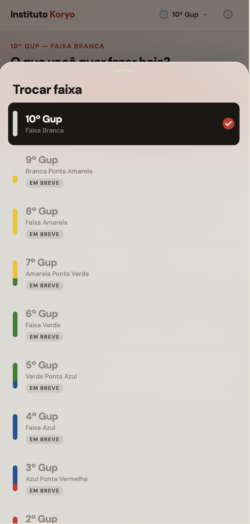
Grade selector. Belt color as the visual identifier. Higher grades gated — content added in batches.
Content libraries for theory, fundamental techniques, kicks, stances, and patterns, each structured as a reference for mid-class lookup. Korean to Portuguese flashcards covering the full vocabulary for each grade. A quiz mode that generates questions from the active grade's curriculum and runs the student through them with immediate feedback and contextual reminders. Grade selection from 10th Gup to 1st Gup, with higher grades gated as content is added.
The quiz is the most-used feature before exams. Students run it repeatedly, not once to check readiness, but as the study method itself. Active recall over passive reading. That pattern was the design intent; watching it happen confirmed it was the right call.
The app is mobile-only. Students use it on phones during class, not at desks. Every layout decision assumes portrait orientation, one-handed use, and 10-second sessions. A content card that requires scrolling to read failed the use case. A quiz question that requires context to answer failed the use case. The constraint produced a leaner product than a desktop-first approach would have.
Type size starts at 16px and scales up for older users in content-heavy views. Touch targets are minimum 44px. The quiz answer options are full-width, tapping anywhere on the card registers the answer, not just the text. Students in their 50s and 60s do not struggle with the interface because the interface does not ask them to be precise.
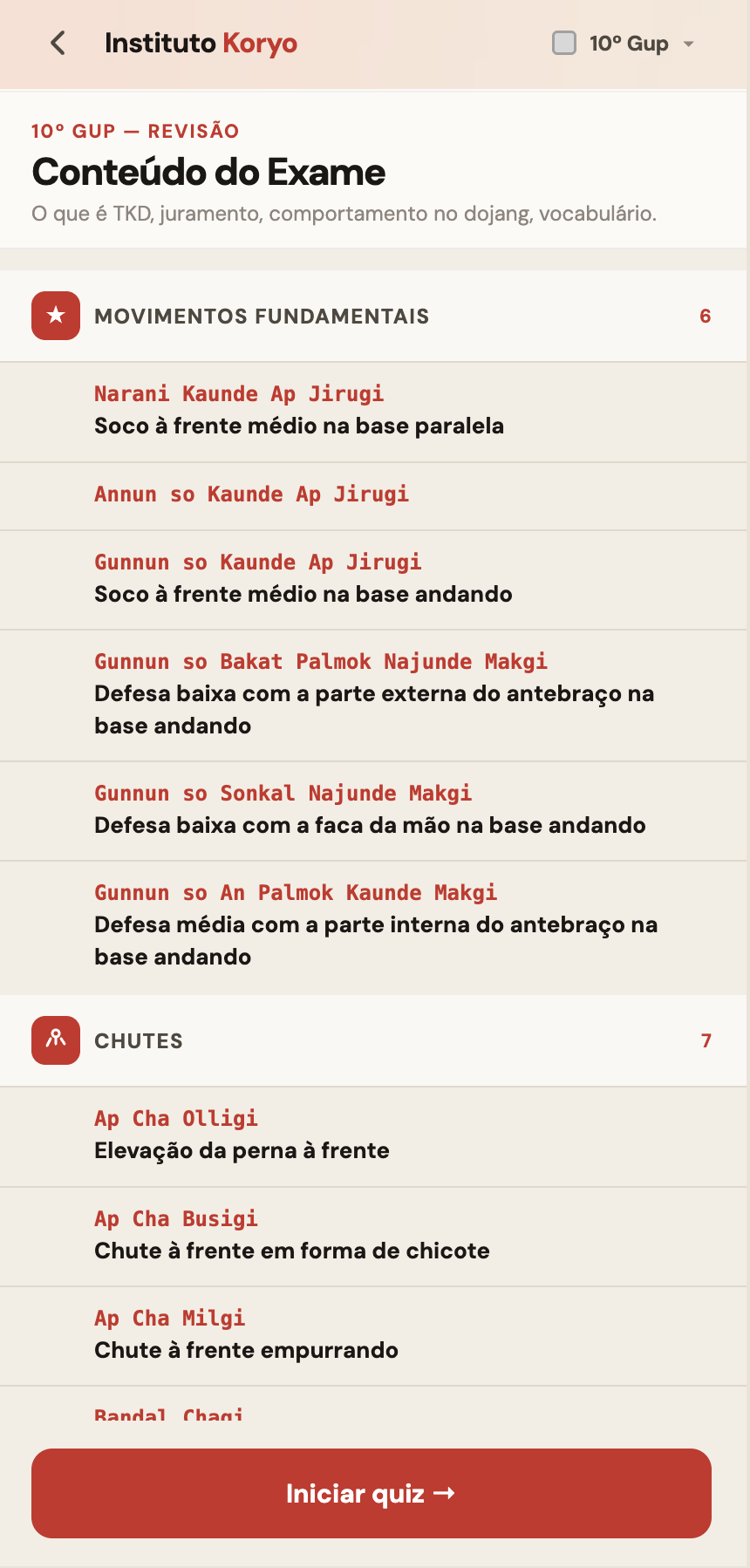
Exam content view. Full grade curriculum grouped by category, item count visible, quiz entry at the bottom.
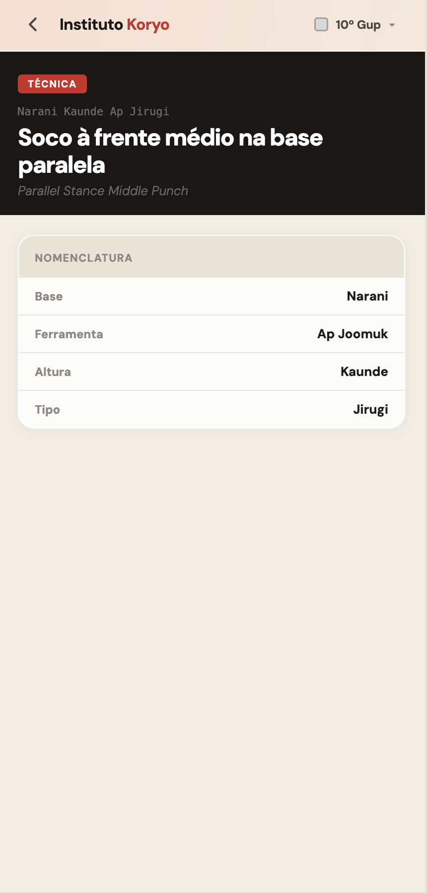
Technique detail. Korean name, Portuguese translation, English reference, nomenclature breakdown by component.
Theory card. Category label, title, structured content. Black header differentiates reference mode from quiz mode.
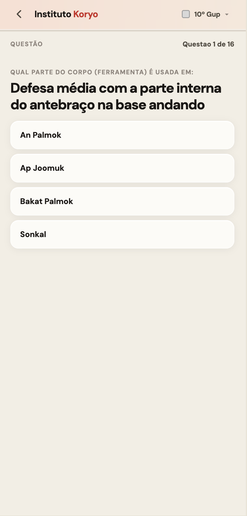
Quiz question. Four options, one correct. No time pressure — recall over reaction speed.
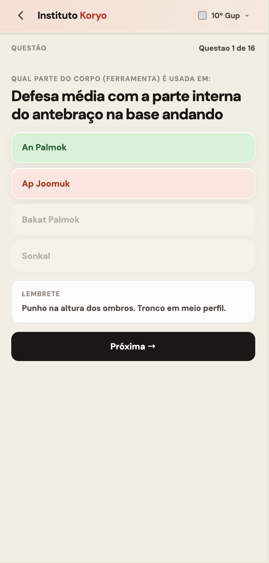
Answer revealed. Correct in green, selected wrong in red, unchosen options fade. Contextual reminder surfaces beneath the answer.

Vocabulary question. Korean term with hangul characters, four Portuguese options. Same quiz engine across all content types.
I am face to face with the users three times a week. When something confuses a student I see it immediately. When a feature works I see that too. The feedback loop that takes weeks in enterprise products takes minutes here.
That proximity changes how product decisions get made. A/B tests and analytics tell you what happened. Watching a 58-year-old student find a technique in 10 seconds during class tells you why it matters. Both are valid. They are not equivalent.
Videos, photos and diagrams are in the roadmap, sequenced by grade and technique frequency. Open search ships next. Every addition is prioritised by what students ask for out loud, not by what usage data suggests.