QUOTA MANAGEMENT
There was no product to replace. No prior version to reference. Just a set of business needs, a stack of workshop notes, and a constraint to fit seamlessly into a tool ecosystem the client already owned.
A B2B BSS telecom platform needed a dedicated asset management tool. The screens shown here are illustrative design explorations representing how I would have approached the product unconstrained by the client's existing visual patterns. They are not reproductions of client deliverables. Support agents from both the client organisation and their partners use it to manage data quota usage, monitor API consumption and submit change requests through structured approval flows. Nothing existed before this project started. I was the only designer.
Solo designer on the project. Led all design decisions from information architecture and user flows to interaction patterns and visual design. Responsible for cross-functional alignment across 6 stakeholder groups. No client development involvement in the design process.
Production-ready design across 13 end-to-end user flows, 3 core modules, and a configurable approval system. Pending client-side deployment. Design validated across 6 stakeholder review cycles with zero unresolved blocking issues at handoff.
Client identity omitted per NDA. Strategic challenges, decisions and outcomes are accurate.
End-to-end flows delivered at production quality: happy path, validation errors, empty states, loading states. Every flow complete before handoff.
Unresolved blocking issues at handoff across 6 stakeholder review cycles. Every open item tracked, escalated, and closed before the file was handed to engineering.
Stakeholder groups aligned: client business, product, program management, plus internal business, engineering and QA. Design was the only function present in every session.
There is no existing behaviour to study on a greenfield project. No baseline to improve, no shared mental model to anchor decisions to. Everything is established from first principles.
The constraint that gave the project shape was the client's existing tool ecosystem. They already had products their teams used daily. The new platform had to match those visual patterns and interaction conventions closely enough that support agents could switch between tools without relearning. That boundary was the most useful design decision on the project, and it was established before I drew a single screen.
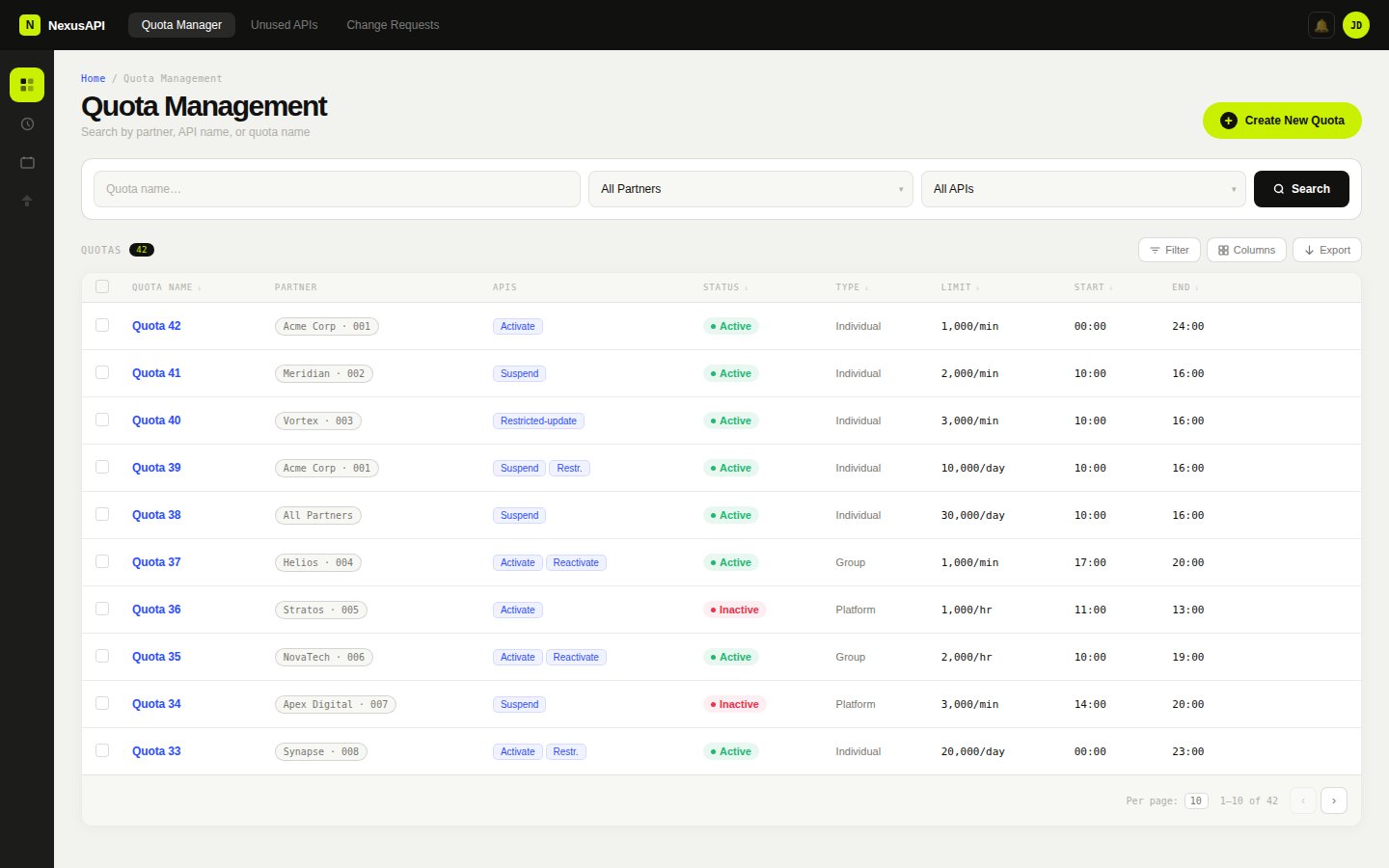
Quota management list. Search by partner, API name or quota name. Status badges, type, limit and time window visible at a glance.
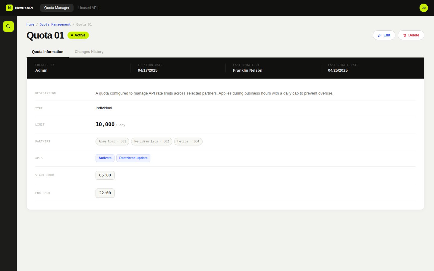
Quota detail view. Metadata, type, limit, partners and APIs in a structured field layout. Two tabs: Quota Information and Changes History.
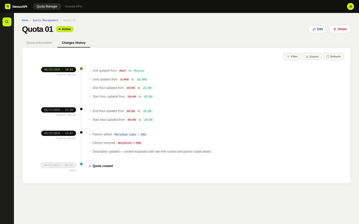
Changes history tab. Full audit trail with timestamped sessions, diff coloring for removed and added values, per-session grouping.
Workshops were the primary input. Six stakeholder groups across two organisations: client business, product, program management, and from my company, business, development and QA.
I brought preliminary concept sketches into sessions rather than arriving with blank paper. A rough flow or unfinished layout gives people something to react to. It is faster to agree on what something is not than to construct what it is from an empty whiteboard.
The diagram below shows the cross-functional structure. Each group owned a specific decision category. Design was the only constant across all six. The most persistent source of scope drift was misalignment between groups, not between any group and design.
Workshop-to-output method
Preliminary concept sketches brought into sessions as thinking tools. Each cycle produced locked decisions and flagged dependencies.
I let sessions run where they ran. In retrospect that was the wrong call.
The client was still defining the product internally while we were designing it. Decisions agreed in one session would shift by the next because they had not been ratified by people who were not in the room.
I let sessions run where they ran. If a discussion deviated from the agenda, I followed it. In retrospect that was the wrong call. The deviations were symptoms of unresolved internal alignment, not genuine scope clarifications.
From that point I changed how I worked. Before committing to detailed design on any new flow, I asked explicitly who needed to ratify the decision before it could be treated as stable. That question was uncomfortable in early sessions but it saved more time than it cost.
Cross-functional alignment map
Six stakeholder groups, two sides. Design was the only function present in every session.
Every flow was designed to the same completeness standard: happy path, validation errors, empty states, loading states. For a greenfield product with no existing behaviour to reference, those states needed to be as considered as the primary flows.
The quota list empty state explains why the list is empty and what action creates the first record. It distinguishes between 'no quotas have been created' and 'no quotas match your filter'. Two different situations that look identical if you only design one of them. The create flow validates inline, field by field, with error messages that name the constraint rather than just flagging the field. The approval workflow surfaces rejection reasons inline in the audit log, not hidden in a status badge.
A note on the status badge system: the illustrative screens use color to encode quota status. In the production specification, each status badge pairs color with a text label and an icon to meet WCAG 1.4.1 non-text contrast requirements.
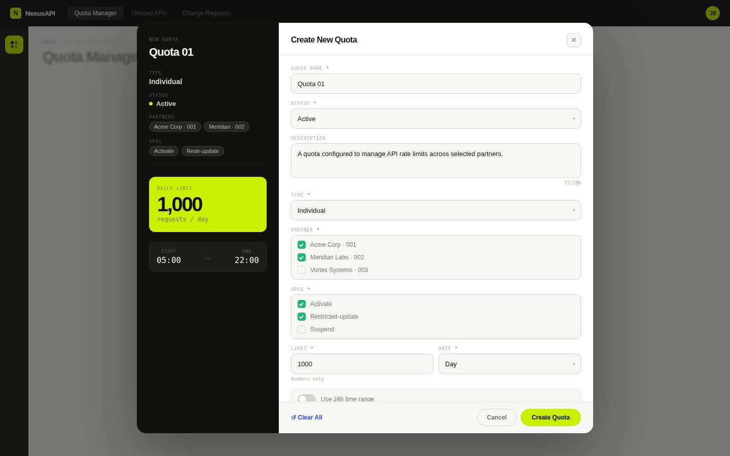
Create quota flow with live preview panel. Form updates the preview in real time. Partners, APIs, limit and time window visible before submitting.
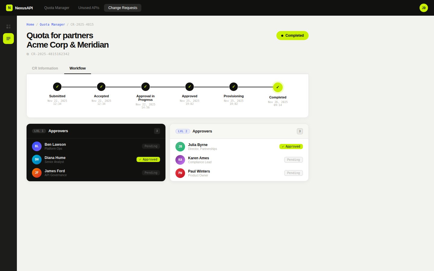
Change request approval workflow. Two-level approver groups with individual status tracking. Full audit trail from submission to completion.
Support agents on this platform process 30 or more approval requests per day. The keyboard interaction model was specced as a first-class requirement, not a post-handoff accessibility audit.
The list view supports arrow key navigation between rows without Tab cycling. Tab is reserved for moving between UI regions, not list items. Every drawer and modal has a defined entry point, an exit point, and no keyboard traps. The approval workflow supports Ctrl+Enter submission from any field so agents can move through a queue without reaching for the mouse.
Focus states use a 2px solid outline at 2px offset in the brand red (#C42B2B), applied consistently across every interactive element. The focus ring is never suppressed, never overridden to a lower-contrast version, and never hidden in favour of a hover state.
The platform is multi-tenant. A change request submitted by one client organisation routes through approval groups that may include users from another. At the scale this product was designed for, hundreds of partner organisations, thousands of approval actions per day, every interaction pattern decision compounds. A confirmation dialog that adds two seconds per approval adds hours of lost time per day across the user base. That arithmetic shaped every micro-decision in the approval flow.
Keyboard interaction model
Full keyboard spec across list view, approval workflow, and create flow. Focus states use 2px solid #C42B2B at 2px offset, never suppressed.
The platform covers three modules across 13 end-to-end user flows, each with full validation states, empty states and error handling. Quota management gives agents visibility into consumption at the client and partner level, with manual adjustment controls and threshold alerts. API usage monitoring surfaces rate limit status and consumption trends. Change requests route through a configurable multi-level approval flow with a full audit log.
The platform is pending client-side deployment. The delay is on the client's timeline. I used the time since handoff to work through edge cases and handoff refinements with developers and business analysts. That is the kind of detail work that only surfaces when someone is actually trying to build from your files.
The platform is desktop-only by design. Support agents and approval managers work from fixed workstations, not phones. That constraint was confirmed in the first workshop session and shaped every layout decision, dense data tables, multi-column forms, keyboard-first interaction patterns. Designing for the wrong viewport would have been the wrong call regardless of what the design trends said.
Change request approval flow
Three request types routing to three approval structures. Configurable per client sign-off hierarchy.